Color, Color Everywhere, Part 3

WEB_8732

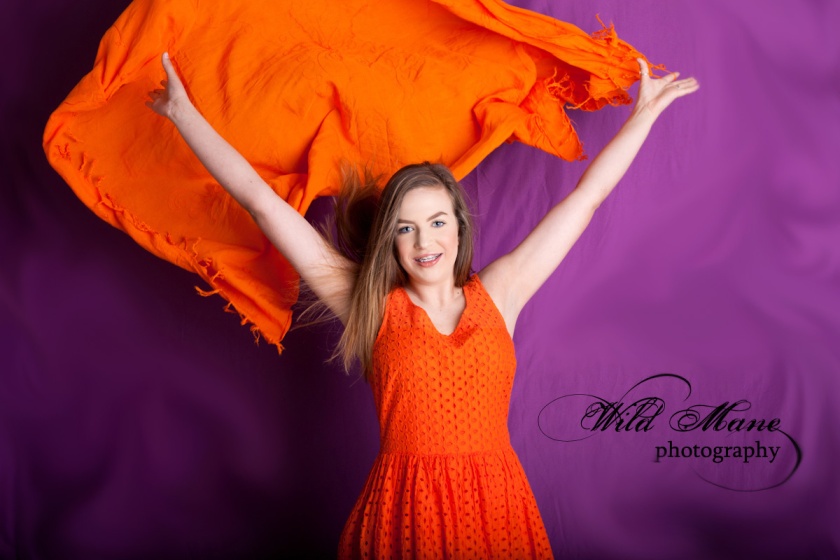
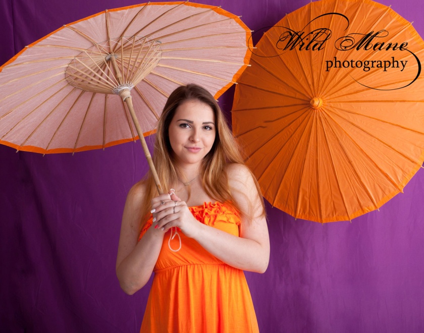
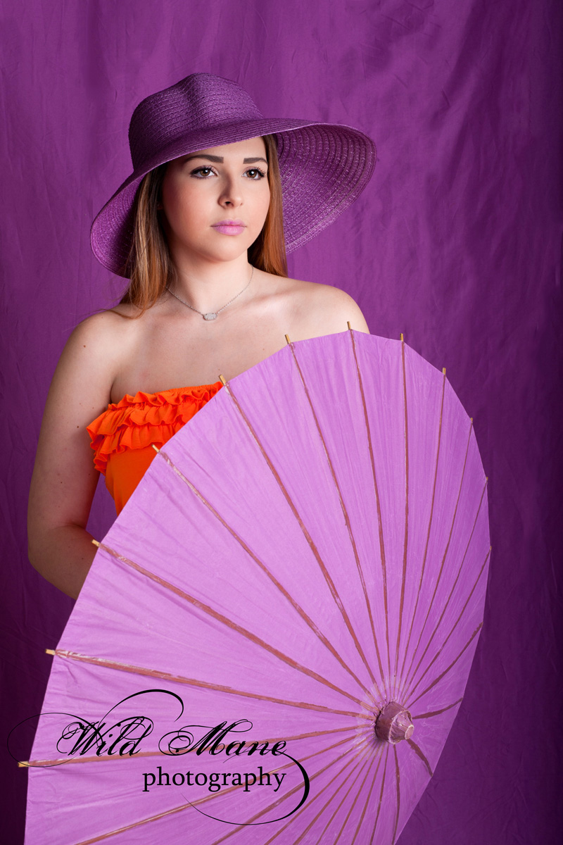
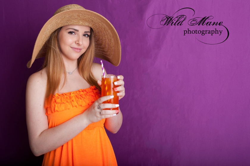
This third and final part of the Color Block Photo shoot features our second model, Jordan.   I just love all of this purple.  Jordan did a great job posing and connecting with our cameras.  Her personality shines in these.

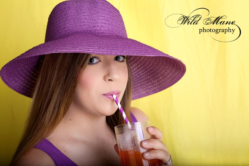
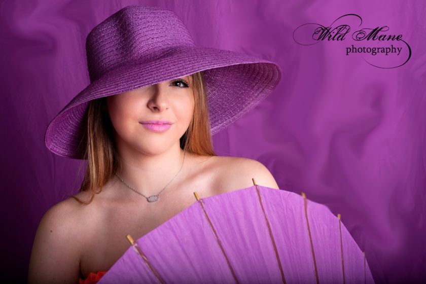
This is purple hat began as a white one and ended up purple thanks to spray paint.  It was such fun preparing for this session.  We shopped, shopped and shopped some more. Building a vision isn’t easy. Just wait until you see the next concept shoot.

WEB_8682

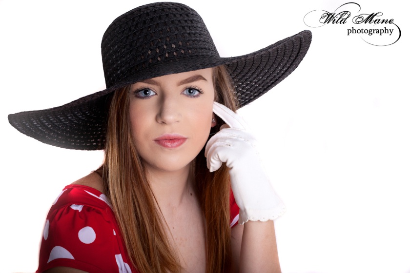
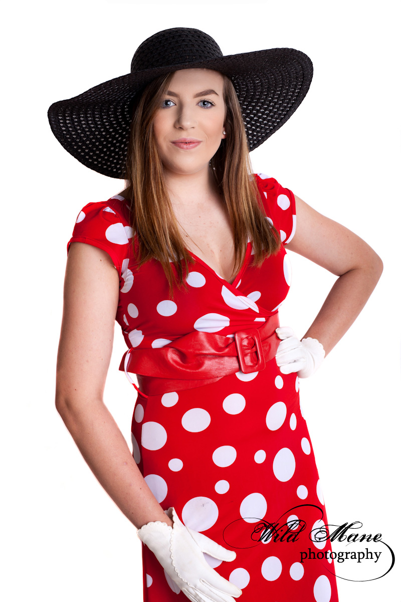
We may need to start calling Jordan the “Hat Girl”. She certainly wears hats well.  This natural colored hat may be my favorite. Very few can wear it with such aplomb. Actually our other model, Danielle, looked great in it, too. We were lucky to have such super young ladies to model for Color Block.

WEB_8585

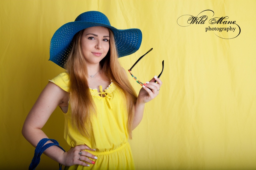
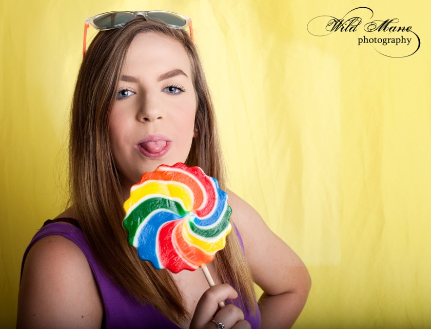
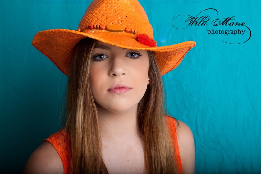
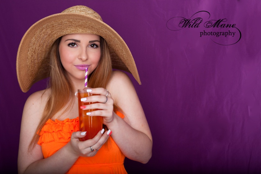
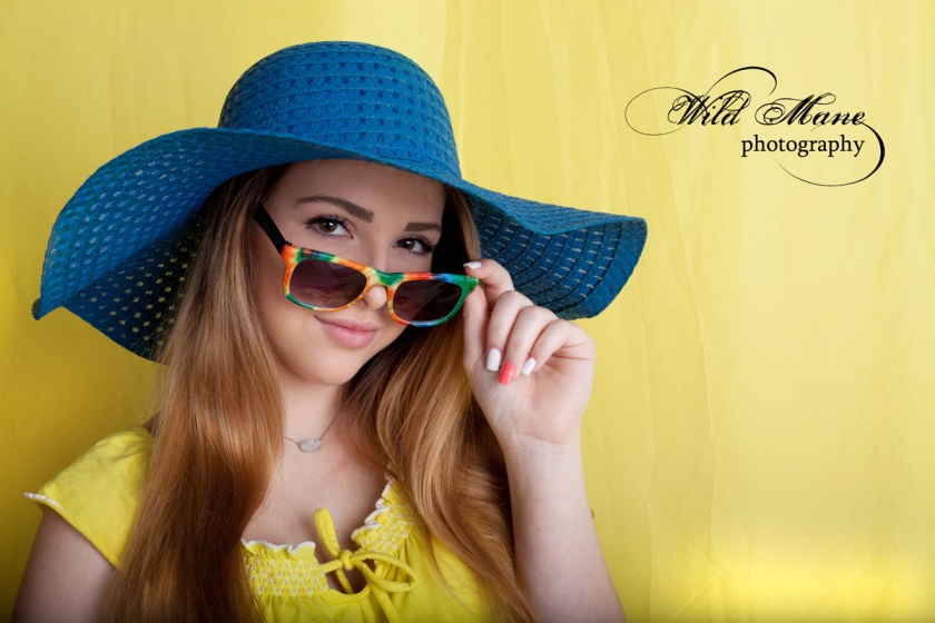
The yellow series really pops.  The royal blue is the perfect compliment.   The purple would also look nice. We were swapping outfits and backgrounds for nearly 3 hours as we photographed.  It took a lot of time even in its simplicity to prepare and shoot this session.

WEB_8565_BW

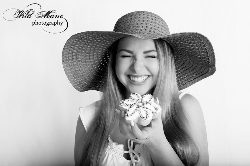
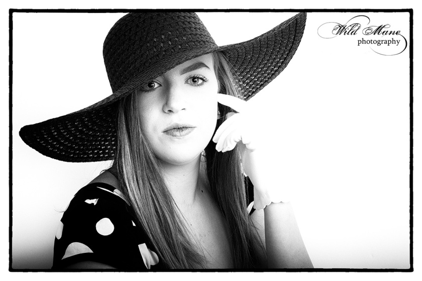
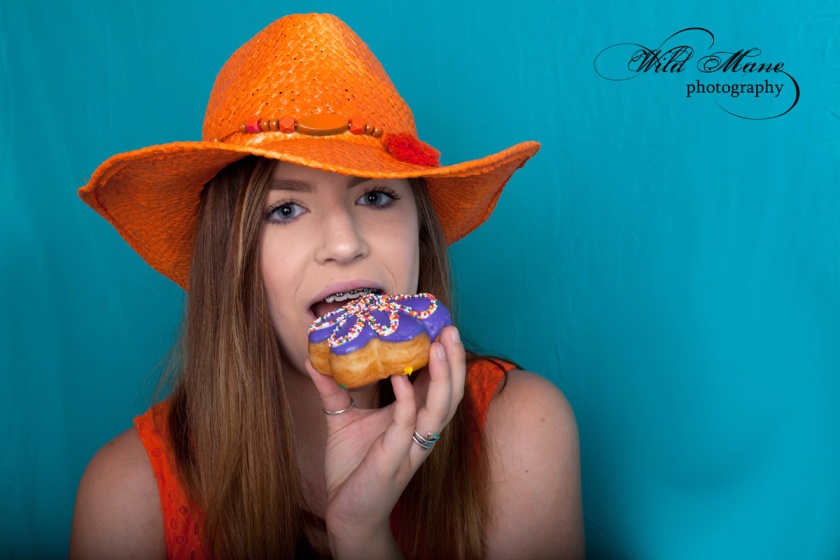
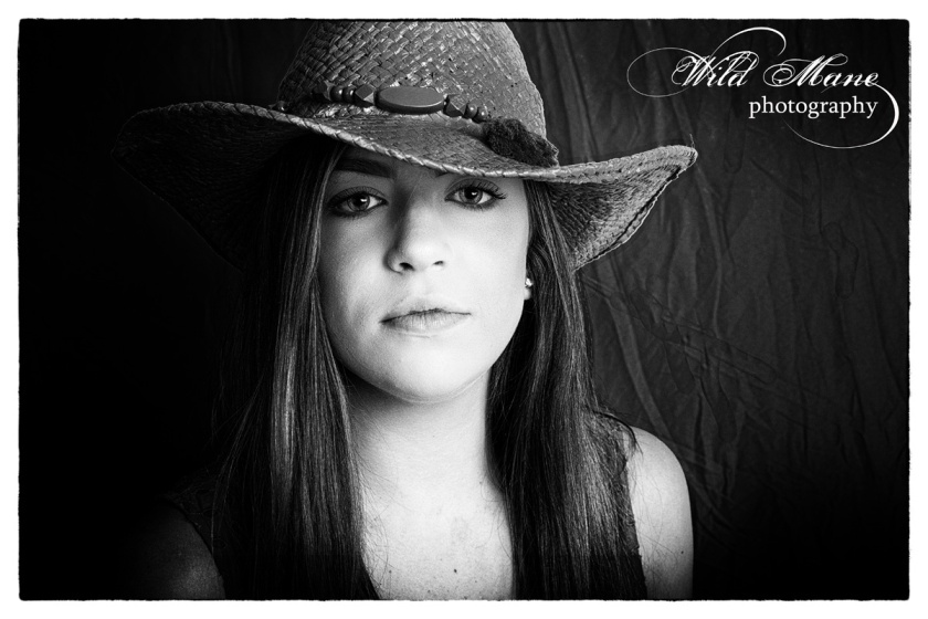
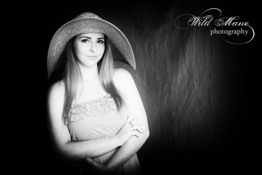
With all of the color, I couldn’t resist converting some to black and white.  Don’t you just love Jordan’s expression.  And she didn’t even get to take a big bite out of that fancy donut.  At least not until later.  We sent the girls home armed with a box of donuts.

WEB_8576

Since I am trying to think “commercial” as I shoot these days, I shot this and a number of the other images with negative space on one side or the other.   That works well if text needs to be added for a project.

WEB_8727

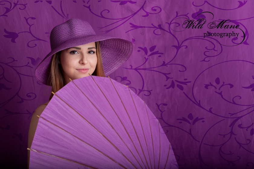
After all is said and done, I think my favorite images of Jordan are on the purple background.  I did add the pattern to this one just for interest.

Until next time, stay cool!


Color, Color Everywhere, Part 2

WEB_-8759

Color everywhere doesn’t always mean vivid backgrounds. Sometimes a white background is the perfect thing for color like this outfit.   It makes it and our model pop off the page.  And, these images look equally good in black and white with their high contrast.

WEB_8755_bw


Part 2 of Color, Color Everywhere features Danielle.  She was one of our two lovely models.  She did a great job and was very willing to go along with all of our crazy ideas including wearing shoes we spray painted bright orange which, of course, don’t show in this next shot.  I have found over the years that I rarely shoot full bodies.  It isn’t what I like.  I guess I may as well quit worrying about what my models have on their feet!

WEB_-8709_A

We intentionally chose fairly flat lighting for this session.  We used a 96″  parabolic umbrella with a diffuser and a 48″ octabox.  We still got directional light but very little shadow.

Since I am involved in the Project 52 commercial photography course this year, you’ll notice that we incorporated food in some of our shots.   Some are silly shots but all coordinated with the overall color themes we used.

WEB_8608

WEB_8641

As you can see, Danielle was asked to pose in different outfits with different moods and with looks from silly to sophisticated.  I think Danielle had a good time.  We certainly did.

WEB_-8768

My next blog entry will be part 3 of this series and the last of the series.  It will feature Jordan who was our second model.  See you soon!

Color, Color Everywhere!


WEB_8692

I did a Color Block photo shoot with another professional photographer and it was fun, fun, fun! We had two delightful young ladies who modeled for us.  Our concept was to use wildly bright colors using several different backgrounds with various outfits we provided in complimentary colors.

WEB_8623

It took us weeks to pull all of the “stuff” together that we needed.  The backgrounds were the easiest thanks to Groupon.  Trips to several different thrift stores, dollar stores and paint shops got us started with hats, purses, shoes, scarves, makeup, nail polish, eyeliners lipsticks and even wigs.  We didn’t use everything we got in this session.  It took multiple hours to shoot two models with multiple changes each.  We plan a second session sometime later.  Along with some existing clothing and props like umbrellas that we already had, we were ready to start putting everything together for different sets. Once we began putting outfits to background, we started spray painting accessories like hats and shoes to complete our desired looks.  It’s amazing how spray painted straw hats (like the purple one above) come out so well.

WEB_8729

We mixed and matched hats with different dresses.  As we shot different looks and scenes, we each had images created by our own individual styles.  Once we got going, we found ourselves coming up with more ideas than we could possibly shoot in one afternoon.  These concept shoots get so exciting as we expand our original ideas to match our enthusiasm and our models’ personalities.  When I got to post production, I found some of these bright images also looked intriguing in black and white.  On the other hand, you can’t see that turquoise background, orange dress or that orange hat.  I love this moody look, though.

WEB_8629_FILM NOIR

WEB_8629

WEB_8673

WEB_8675

This is just a taste of how our Color Block concept shoot went.  I’ll write about this again with more details, more pictures and more backgrounds soon.  See you next time.  Happy Saturday!

The Pour

I had another “stretching” assignment this week.  By stretching, I mean me!  How many of you have been asked to do a pouring shot that shows both the item used for pouring and the item receiving the liquid.  The liquid had to be frozen in motion and crystal clear.  This took a whole lot of practice and finally my husband’s help to accomplish.  It was something I have never done before.  Lighting is completely different than what I use for portraits.

The assignment:  Shoot a verticle image that shows that is appropriate for a front cover of Pour magazine.   The liquid must be tack sharp and the lighting must show the edges of the bottle or glass well, any labels readable and room left for the name of the magazine.  Since I began alone and was working in my studio, I started practicing with water in an empty fish tank so all the water didn’t end up on the floor.  I had to shoot from my tripod so that I could get it focused and ready before I poured.  I used my mirrorless camera which shoots 11 frames per second and began with just water and a pitcher.  I stood beside my tripod and pushed my shutter button down with my right hand and poured water with my left.  Here is the initial result:

WEB_8369

I had practiced enough that the bottom of the glass was submerged so the glass looks weird in my opinion.  The pour was over exposed but I did like the bubbles and foam in the glass.

Step 2 was to try and create the pour showing both the pitcher and the glass.  As I did it, I still settled it into the fish tank.  That deep tank stopped me from being able to tilt and glass while I poured and pushed the shutter button.  I went ahead and used the instructor supplied magazine cover template.  There was still water in the bottom and I didn’t have my camera quite straight but at least I was getting there.

4_GloriaMcDonald_Assignment 26

My final image is below.  I wasn’t crazy about the blue image even without the water in the bottom.  I knew I could do better with some help and, thankfully, my husband was more than willing to help me.  I found an ancient bottle that was nearly empty so I mixed food coloring and water until I got a nice amber color.  I added that to what was in the bottle already.  Of course, my studio smelled of booze by the time I was finished but at least it was all in the bottom of the fish tank and not all over the place as it splashed.  The image is lit from behind and reflected with a white board from the front.  That way you can see through the colored liquid and still read the label which was dark without the reflector.  I also had reflectors on both sides.  I attached the glass to a white board with gaffers tape so that I could tilt it.  I wanted to make the glass look as though it was on a table that was tilted and the liquid splashed out of the glass.  My husband poured as I held the glass in one hand and pushed the shutter with the other.  Thank heavens for tripods!  In retrospect I would have liked it best without those foamy bubbles on the surface but I submitted it like this.  My instructor liked it a lot and also showed me how to make the top edge of that glass bottle show up better next time.

GloriaMcDonald_Assignment 26

All in all I learned a lot and was much happier with kthis final image than I was as I went through stages 1 and 2.  I really appreciate the technical expertise of pour shots now that I have done some myself.  I look forward to improving my skills with this as time goes on.  That fish tank was a real life saver since I didn’t want to drag all of my equipment outdoors to shot this assignment.

Well, next week is another cover assignment.  This time I even got to use a human!  See you next week.


A Campaign for Coke

This week’s class assignment is one that took some preparation and a lot of thought.  We were to study the new Coca-Cola ad campaign, “Taste the Feeling”, and then create two images that could have been used for that campaign.  It was to have the vintage look that Coke is known for but with a modern twist.  It was also to represent my region of the country in flavor.  Since I’m in Texas, it seemed appropriate to create an image using a western dressed model and add a horse or two for good measure.   Here is the first of the two images that I submitted for critique:

1GloriaMcDonald_Assignment#24

In order to meet the requirements, I went to three stores in search of a glass coke bottle.  I did find some little 8 oz. bottles at Kroger but they certainly didn’t look vintage so I continued my search.  I finally found 12 oz. bottles at a Mexican Grocery Store in Denton, TX.  I also learned that Mexican coke is made with cane sugar instead of the high fructose corn syrup that is used in the United States.  I bought 4 bottles of Mexican Coke along with fresh guacamole and some tortilla chips (not necessary for the assignment but who cares).

Take a look at the horse in this image.  That is Reyanna, my buckskin quarter horse.  During this photo session, she discovered that coke is really good.  Once she discovered that, she wouldn’t leave my model, Julee, alone.  Reyanna was after that coke in this image.  Julee was such a good sport and it was great to catch the interaction between them.  The day was windy and very overcast but so I added a little fill light from a strobe in a strip box.

The second image includes a second horse, Safari.  The interaction created a casual, fun image with coke right in the middle of it.  The images that were used for the real campaign all have a color cast added to give them that vintage look that we have seen over the years in the older Coca-Cola ads.  I added an amber cast that I added to both of these images.  I think it carries the vintage idea but is also subtle.  Here it is:

2GloriaMcDonald_Assignment #24

All in all is was a successful photo session and a fun one.  The horses decided that that hat might taste even better than a Coke and they played right into my hands when they did that. My goal was to make sure that these images looked casual, unposed and showed Coca-Cola as an integrated part of them.

I decided not to use these last two images for my critique but I like them so much that I thought I’d include them in this blog. I love Julee’s hat and that coke bottle really shows up.  The last one showcases Reyanna’s new found love of coke.   She was trying to remove that bottle from Julee’s hand so she could slurp it up!

WEB_8143_B_cropped

WEB_8205_B_TINTED

A special thanks to Julee’ Kula, Reyanna and Safari for being great models for this week’s assignment.  See you next week!  In the meantime, enjoy a Coca-Cola and think about fun times.

Tale of Two Perfumes, Part 2

It’s time for Part 2 of this tale.  After turning in the dark perfume layout that I did last week, I had a chance to re-do it.  We were to either catch-up an assignment that we missed, do something totally different and wonderful or redo an earlier assignment that we wanted to improve.  For me, that dark bottle had to be redone.  I didn’t even like the perfume itself that I purchased the first time around.  I thought I did until I actually squirted it beneath my ears and on my wrists.   It made me wheeze and it was very strong smelling when I used it more than one squirt on the wrist in the store.  Since I knew I couldn’t wear it, I returned it to the store and exchanged it for this bottle of Givenchy that is lighter and doesn’t make me wheeze.  I squirted it all over and walked around the store to make sure it would work for me this time.  What luck that I got to switch scents, and in turn, containers.

SECOND FLORAL AD_2

Just like last time, I was surprised by what the box contained for a lid.  I ended up liking both the lid and bottle and this re-done layout a whole lot better than the “green” layout.  Sometimes my stomach just doesn’t feel good when I look at a finished image.  That’s why I knew I needed to take another shot at the perfume assignment.   The light colored bottle helped with creating a Spring look this time.  The bottle looked a little bronze sometimes and pink in other lights.  By combining both of those colors in my backgrounds and props, I ended up with a layout that is pleasing to the eye, shows off the bottle with carefully placed lights and I ended up with new perfume that I like and apparently likes me back.

See you next week!  The assignment is Coca-Cola time!  I can’t wait!

Tale of Two Perfumes, Part 1

The assignment was to photograph perfume for a 3 image spring theme magazine spread.

I have been stretched a whole lot in the last two weeks.  Through frustration, re-done image shots and balancing colors, I believe that I’m growing.   All of this bluster is due to my Project 52 Commercial Photography course.  The assignment was to photograph perfume for a 3 image spring theme magazine spread.  Images needed included a vertical, a horizontal and a square.  All images must present the client’s perfume using the Fragrances of Spring theme.

GloriaMcDonald_Assignment 22

I was due for new perfume so I headed to Ulta to find a nice new scent that would make me happy and that provide me with a full bottle to photograph for my assignment.  The surprise part of this was that only the bottle was in the store to see.  I didn’t have any idea what the cap looked like until I opened the cellophane wrapped box when I got home. What I found was a lid added to the bottle looked like a Marc Jacob’s purse complete with a shiny chain handle.  I bought that scent after squirting some on my wrist.  The scent seemed nice so I got it.

Unfortunately, or fortunately, depending upon how you look at it, that perfume choice was the wrong one for me on two counts.  First, I didn’t like the dark bottle for a spring layout but as a commercial photographer, one must work with what the client has provided so I used it anyway.  Second, the perfume proved to be far too strong and something in it caused me to feel icky.   I worked for an entire week shooting, re-shooting, using different props and re-arranging lighting before I finally finished the assignment.  I had no idea how hard it is to shoot an image of a bottle of liquid.  Anything shiny must show as shiny but the reflections aren’t good if they show the photographer reflected like in a mirror. The lighting needs to carefully show the edges of the bottles which many times are faceted.  Most important, the letters on the bottle must be very readable and in sharp focus.  So, a week later, I ended up with this image.

I turned this in for my assignment but was far from happy.  It just didn’t feel right and there were two things that stood out that my instructor analyzed during the class.  The bottle on the upper right shows the lettering very clearly.  However, the letters look black instead of the gold that show on the other two images.  It was the way the light and the reflectors hit the bottle but I should have corrected that in post production.   I was so frustrated that I didn’t even notice the gold missing.  The second issue, I knew was there but could not figure out how to fix it.   In the lower right image, there is a reflection that is very white on the outside edge of the bottle.  It looks like a white vertical stripe on the end of the bottle.  That is caused from the reflection from the backlight to the reflector and on to the bottle.  I now know how to fix when I am shooting.  Fixing it in post I found impossible.  All in all I learned a lot but I didn’t feel good about my final image.  Even though technically it was OK other than those two issues, I just didn’t like it.

My assignment was a free shoot.  This means that we can shoot something that we want to shoot, make up any assignments missed or re-shoot something we want to improve.  I chose #3.  Next week, you will see the perfume assignment with an entirely new interpretation, a new bottle and an image that makes me far happier.  I hope you, too, find it more pleasing for a spring layout.  Hope to see you next week.


2017: A Year of Change

This week’s assignment in Project 52 was a fun one for me.  It did take some thinking prior to shooting, however.  We were to photograph something that could be used for a magazine article.  It had to be upbeat, innovative and revolutionize each of our particular genres of photography.  Since most of my work includes people and the innovation involves something directly connected to me, I thought that it would interest many others.  Now the proof is in the pudding.  Do let me know what you think please.

GloriaMcDonald_Assignment21_NewYearDROP SHADOW
I have been photographing and running Wild Mane Photography since 2004.  It has been a real joy but it has also been hard on my back.  It is the plight of many long time photographers.  Lugging heavy lights, light stands, cameras, and all the accessories to selected locations has definitely taken its toll on me.  Each year it gets harder to recover after a long photo session especially when we’ve moved to several locations as I shoot.  I have been avoiding lugging my heavy camera with those heavy lenses to every place under the sun and have been using my phone for personal pictures.

For Christmas, my husband bought me a Sony A6000 mirrorless camera.  I have used Canon since I switched from my little Kodak Brown as a child.  I’ve also have Canon top of the line lenses.  When I opened my new little Sony, it looked like a toy.  It is feather light, easily fits in my purse and low and behold it produces 24+ megapixel images, shoots in RAW (my preference), shoots in many different modes including aperture priority, shutter priority and manual (always my preference).  It shoots 11 frames per second which is unbelievably fast.  It has a APS-C sensor which isn’t a full frame sensor like my Canon but it is an excellent sensor and by shooting a little wider is easily mitigated. Finally it has image stabilization which may come in handy since it is so small that holding it steady is a little harder and it shoots 1920 x 1080 HD video.  What a dream camera!  The only difficulty for me is learning a completely different camera’s operation.  I have been working on that since Christmas making sure that I can actually make use of all of the creative extras included in this camera.  The left image above was taken with my new mirrorless Sony. The picture on the right shows the difference in size between the two cameras.  Wow, I can even carry the Sony around in my purse so traveling with it is awesome.

As for my assignment, this is my “2017 Year of Change” submission to show my new challenge and my options for the specific shoots that I do this year.  With both cameras, the image quality and options are nearly identical.  These high megapixel cameras can easily print a 40 x 60 print with incredible clarity.

Well, that’s it for this week.  Next assignment is shooting fragrances.   Another challenge!  Talk to you then.   Let me know if you have any questions and have a great week.

Brussels Sprouts or bust!

My commercial photography mentor came up with a flash assignment last week.  In addition to the weekly assignment for class, he added a brussels sprouts flash assignment. Since I am not a fan of them, finding a way to make them appealing was not necessarily in my paradigm.  My initial plan was to take those icky little green balls and turn them into something we wouldn’t have to eat later.  I decided to make them into a Christmas tree with little peppers or red candies for decorations and then sprinkling the whole thing with white glitter.  At least I wouldn’t end up having to eat my creation that way.  Off I went to the store in search of the dreaded brussels sprouts.  Much to my surprise, I didn’t find any of those little things.  Instead all I found was a giant vine of them.  It was so pleasing to the eye that I couldn’t bear to ruin it so I headed to another store.  Much to my horror, the second store presented me with the same giant vine of brussels sprouts.  So, with a game plan change I bought one.  I had it for two days before I finally decided how to create an awesome image with it.  That second day found me heading off to the store again in search of color, shapes and textures to create my vision.   As a matter of fact, in my sprouts search I learned that it is brussels with an “s” sprouts.  Who knew?

Here is my final image.

gloriamcdonald_18-d

For my main light, I used a gridded strip light, a second light with a 7″ reflector with a 20 degree grid and a white board to reflect a hint of light along the base of the sprouts.  I love the way the brussels sprouts twist around that thick vine. Hopefully, the light concentration on the spiral sprouts draws your eye.  I ended up being pleased with the image but now I have to figure out what on earth to do with that green thing.   See you soon!

52 Weeks of Commercial Creativity Week 3

Still Life

This was a very difficult assignment for me.  I have never created a still life image in my life.  We had to have a minimum of 5 objects in the image and one of them had to be a flower.  I found a still life isn’t lit like a portrait, and setting it up is different than a portrait.  I wound up switching props over and over, changing lighting, shoot, reshooting, adding more props and reshooting again.  The entire day was gone before I knew it and I still wasn’t happy.

gloriamcdonald_assignment3-final

I finally ended up with the image you see although I recropped it tighter than the one I submitted.  I wasn’t the only one in class who struggled with this assignment. Those of us who are used to photographing people were all in the same boat.   Some of our classmates love shooting food and other still life subjects.  They excel at it, in fact.  For me, getting the composition just right didn’t happen.  I am anxious to have another assignment so that I can improve on it.  I have to be prepared to shoot many different things in the commercial world rather than people only.  I have to be able to meet a commercial clients needs and create their vision.  I have to be able to fit their mold rather than mine.  I love the challenge even though it drove me crazy trying to get that still life right.  Maybe next time I will follow my vision better and make my still life to show drama, elegance and sophistication.  Then I will be headed to the place I belong and my images will make me happy.

Next week, photographing an entrepreneur.  See you than!