Food Photography – a new pursuit

I just love this latest photographic direction I have added to my arsenal.   It is interesting to look back to 2004 and see the progression of my photographic emphasis as I have grown in my art.  I began making images of horses and their people and photographing horse shows.  That progressed to portraiture from newborns, toddlers, families and high school seniors.  Next came an great interest in photographing women of all ages and making sure they each realized how beautiful they are no matter their age.  Since then, I have also been working on commercial photography and the latest part of that is food.

Food-Gloria-McDonald-2_LOGO

I never would have believed it until I actually began doing it.  It has to be creative.  The lighting has to be perfect and very different than portraiture lighting.  Today, I am going to begin posting my favorites so far.  I hope you like them, too!

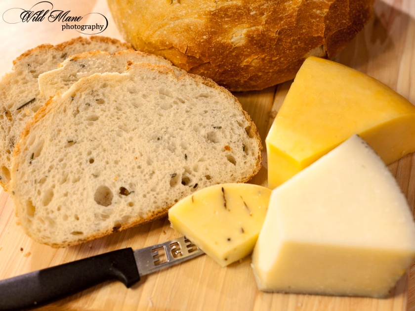
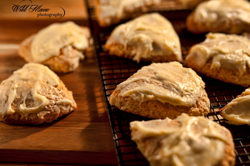
These are orange scones that are yummy.  One of the best things about food photography is in many cases, we get to eat the subjects once the pictures are made.

Food-Gloria-McDonald-3_LOGO

If you like these, there are lots more to come.  Check back or sign up for notifications.  Thanks for taking the time to visit my blog.


Lots going on around here to buzz about

Besides my love of photography, I am busy learning something that is fascinating, loaded with pitfalls and definitely not as easy as it sounded.  We have added 2 beehives to our property.   Bees are having a rough time of it and nobody seems to be figuring out what is causing hive collapse all over the world.  Needless to say, bees are very important pollinators that affect crops of all kinds all over the world.  Besides, honey is pretty darned good.

We began by researching how to care for bees.  Who knew that they get varroa mites, have predator issues, get hive beetles, and diseases?  Not only that but drought causes all kinds of trouble for them along with excess heat.
WEB_-9871

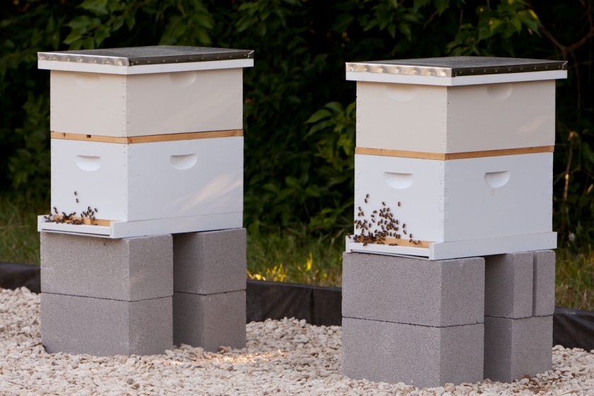
This doesn’t show much but the hive on the left has about 40,000 bees in it.  It is the best of the two hives right now although both have healthy, laying queens.  We saw them both on Saturday thanks to David McCarty who graciously offered to be our mentor.  Heaven knows we need one.  We nearly cooked our bees when we first hit summer by not removing the wooden entrance piece to keep out predators and the base board.  In the pictures that wood piece close to the bottom is the offending heat trapper.

We fed our bees as the hives seemed to be struggling.  Can you believe that they went through 2 gallons per hive of bee syrup (2 parts sugar to 1 part water) every 3 days.  And we  gave them protein bee patties too.  David had us discontinue that and leave them alone for a couple of weeks.  Apparently that syrup or the bee cakes sure got them to work.  Both hives are loaded with pollen, nectar, capped honey both on plastic foundations and bee created honey comb.  Along with all of this we saw, capped brood and larvae.  Those little bees are very industrious and they certainly explain the term “busy as a bee”.  .

I most admit that if you go down there and fool around with them too often they get pretty annoyed.  Even in a full bee suit it isn’t difficult to figure out they are mad and want to sting you and they did.  I was lucky but my husband got stung 3 times through his veil because it was too close to his face.  If it wasn’t for David’s help, I am not so sure we would be willing to continue on with this.  But, most of their anger was caused by us as we visited them too often instead of just letting them do their thing.
20180826_135959

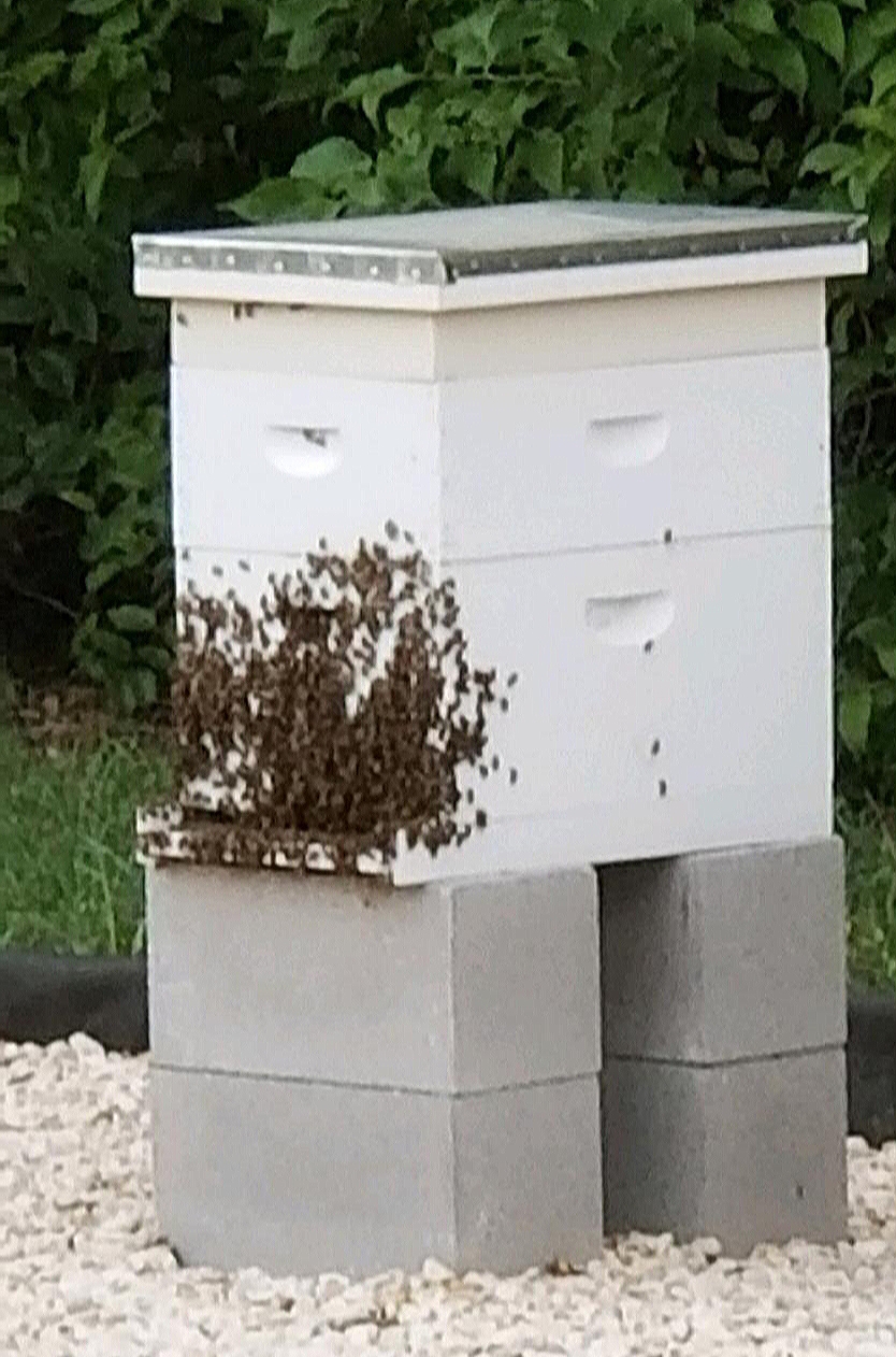
This picture shows you what they do when it gets really hot inside the hive.  After we opened their hive yesterday and went through all the frames, they were hanging on the front of the hive for the rest of the day.  Sorry this is fuzzy.  My husband took it with his cell phone.

The left hive (in top picture) is ready for a 3rd box (a super) as they are already running out of room.   The hive on the right is doing fine but isn’t nearly ready for another super.  These bees are fascinating and require a ton of knowledge that we are trying to learn.  I won’t be bring them in the house as pets but our grandkids did name the queens in each hive so we can keep track of the hives as we grow.  Hive #1 has Queen Alexandria and Hive #2 has Queen Barbara in it.  Barbara is an egg laying machine and Alexandria isn’t all that far behind.  Both queens came from California and they are Italian.

Well, I’ve given you far more information that you probably want.  As winter comes along, so will a whole new set of problems.  I”ll keep sharing as new things happen.
HOLY COW, I’M WAY BEHIND!

It has been nearly a year since I updated my blog.   I was doing so well and then I broke both bones in my lower leg, tore both meniscus and my ACL.  Needless to say, I didn’t photograph a single thing for months.  I narrowly avoided surgery but was in a wheel chair, followed by a walker and finally, a single crutch.  I was also in physical therapy for 6 months.

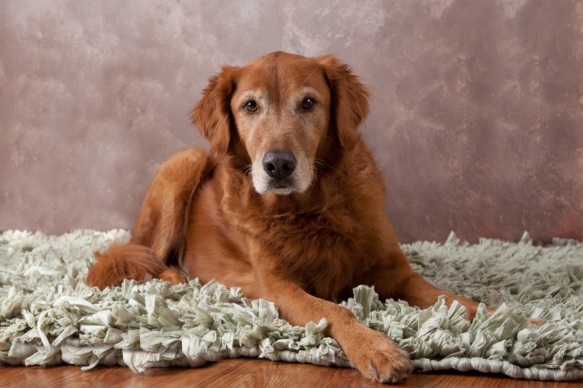
Here is one of the two culprits who caused all of the damage to my left/knee! His name is Clancy and he is our greatly loved Golden Retriever (even after all of the trouble).  It was Clancy and my son’s dog, Deacon (a yellow lab), who were so busy running so fast and playing that they didn’t see me.  Well, the crash wasn’t pretty.  I was struck from behind, sent airborne and landed on a cement driveway somewhat broken.  It was a freak accident with nobody to blame.
Gloria_McDonald_edited

My last blog post was the “Sandwich” post which I photographed shortly before I broke my leg and added a month afterwards.   Needless to say, I sure got out of the blogging habit during that time.  So, I will try to get back in practice.  You’ll be seeing some different images than usual as I post things that have caught my interest not necessarily along my usual photography style or subjects.  But, I’ll also be posting some of my latest headshot works, our latest baby donkeys born and even our newest adventure, bee keeping.  Let me tell you there are some good blogging subjects with those bees!

See you soon…………………………….

.


FOOD FOR THOUGHT

It’s been far too long since I put anything up about my Project 52 class.   A lot has happened including a fractured left leg that has stopped me from participating in much of anything.  I just realized that I never did get the assignment posted that required a sandwich shot.  So here goes:

1GloriaMcDonald_Assignment43

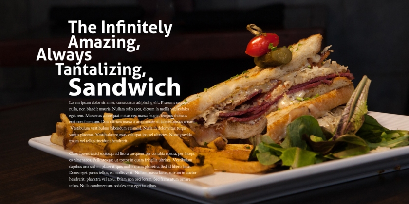
This assignment took some doing.  I wanted to go to a restaurant and shoot it on location rather than shooting in my studio.  Of course, all of that entailed finding a place with an interesting sandwich, dragging my camera and some lighting but making sure that I wasn’t causing a distraction to customers or staff while I did it.  This restaurant in Highland Village, Texas, had a nice patio area, cool square plates and an interesting sandwich.  How I loved being able to research all of this on the internet first.   I would have had to eat at a bunch of places before I found the spot and a good sandwich that I wanted without it.

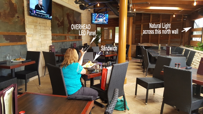
I was also lucky to be able to enjoy lunch with another photographer who graciously came along to hold my LED light for me as I shot.  There was natural light behind me but I wanted light coming in from camera left.  You can see that from the reflection on the red tomato and as it hits the left side of the plate edge.  The sandwich needed to jump off the page so I darkened the background and kept the main lighting focus on the sandwich itself with the light dropping off of the rest of the food.  There was a lot more light in the room that I allowed to show in this image.  Too many distractions would take away from the subject hence the narrow lighting and camera adjustments used to keep the background dark.   The light panel itself is small, lightweight and easy to transport.  I brought two but found that I didn’t need both to get what I wanted.

2GloriaMcDonald_Assignment43

We had waiters and kitchen staff sneak out to watch but all were gracious and let me do my thing.  It was a great help to be in the patio area with few customers.  It also helped that it was mid afternoon instead of during the lunch rush.  All in all, it was a successful shoot.

Please don’t give up on me.  It will be several more weeks before I am able to get out and shoot again but rest assured that I’ll be back.  Until then, enjoy the hints of fall that I hope are right around the corner.

Color, Color Everywhere, Part 3

WEB_8732

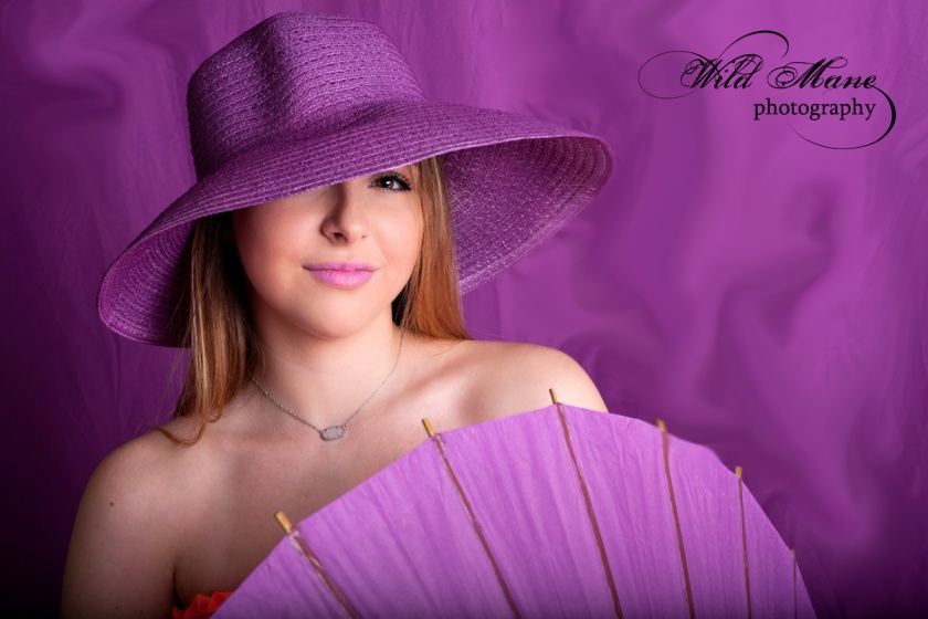
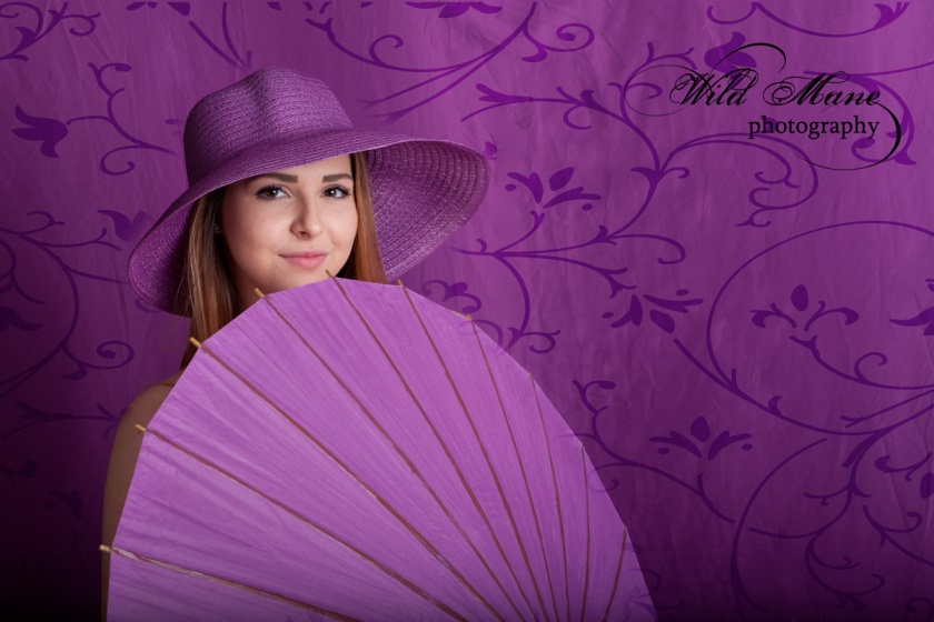
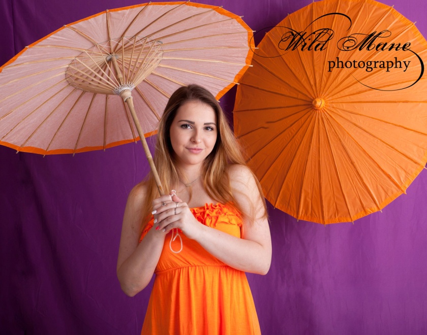
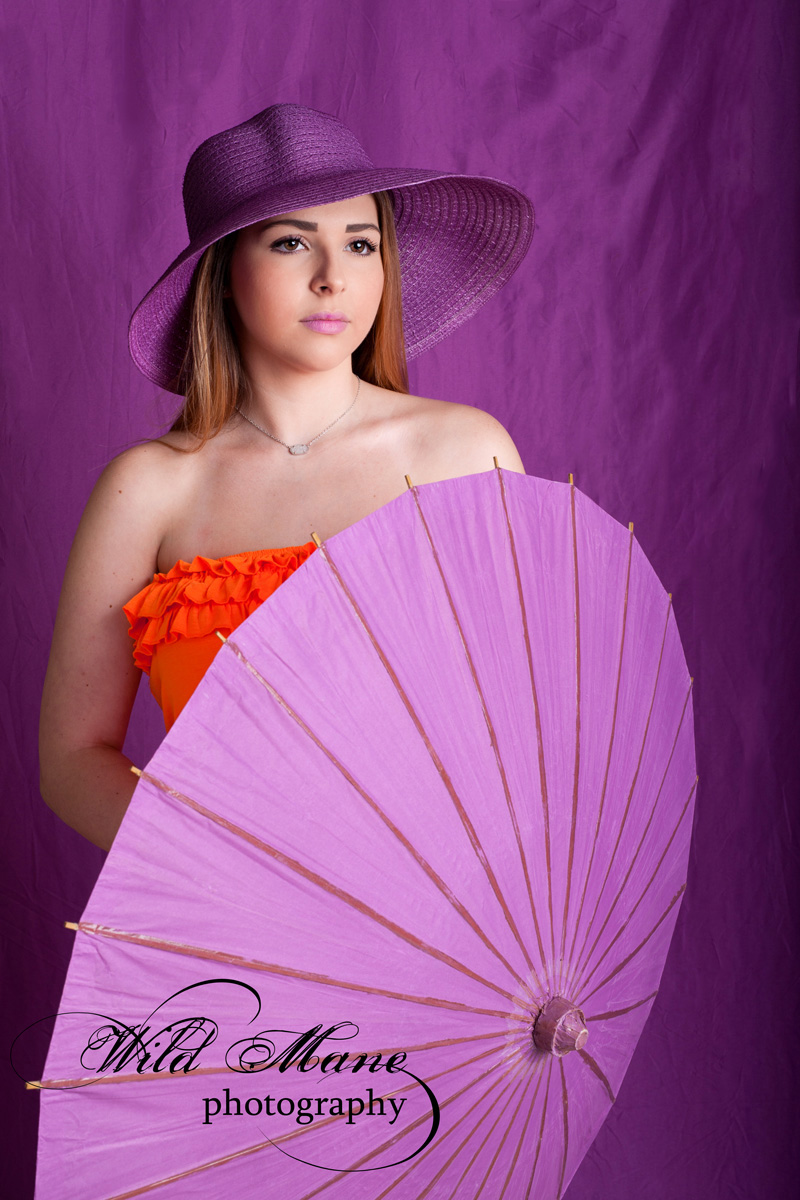
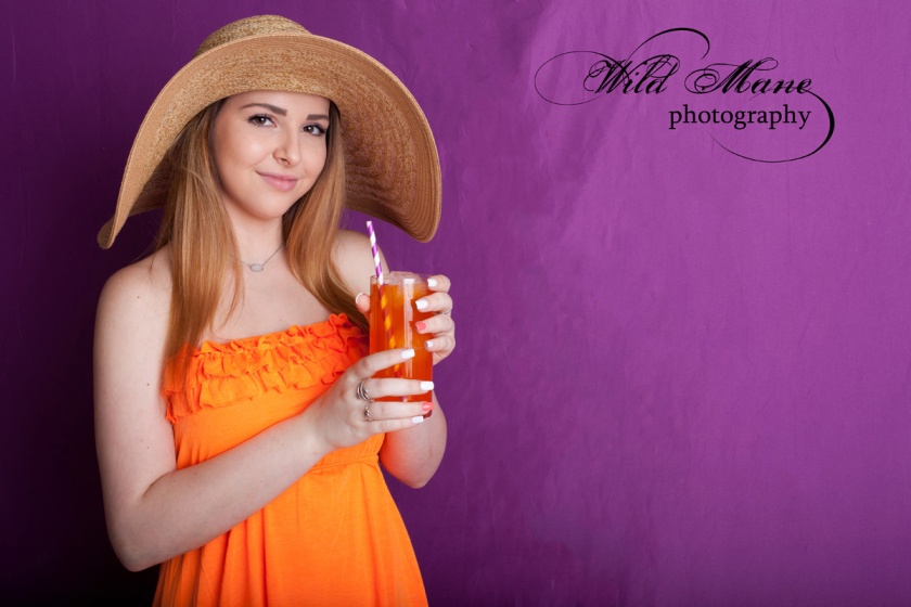
This third and final part of the Color Block Photo shoot features our second model, Jordan.   I just love all of this purple.  Jordan did a great job posing and connecting with our cameras.  Her personality shines in these.
This is purple hat began as a white one and ended up purple thanks to spray paint.  It was such fun preparing for this session.  We shopped, shopped and shopped some more. Building a vision isn’t easy. Just wait until you see the next concept shoot.

WEB_8682

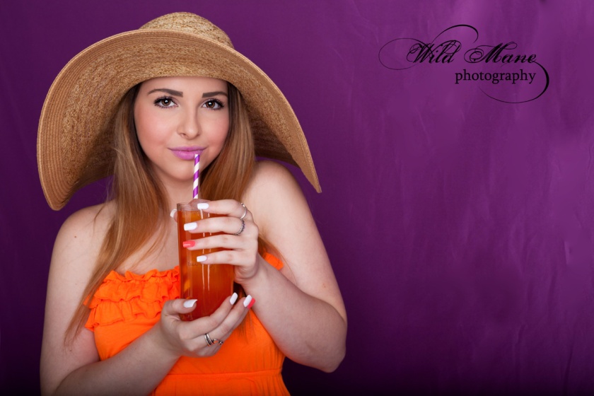
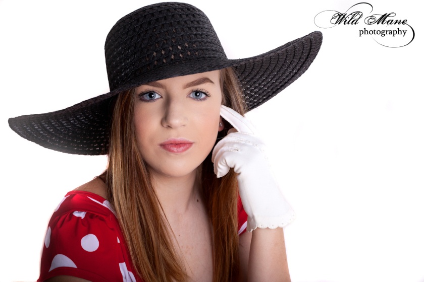
We may need to start calling Jordan the “Hat Girl”. She certainly wears hats well.  This natural colored hat may be my favorite. Very few can wear it with such aplomb. Actually our other model, Danielle, looked great in it, too. We were lucky to have such super young ladies to model for Color Block.

WEB_8585

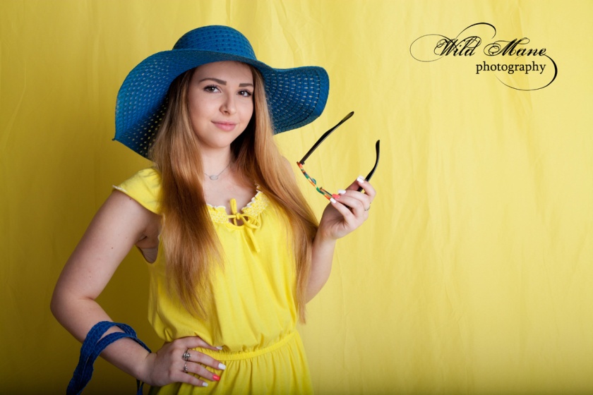
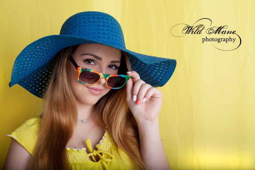
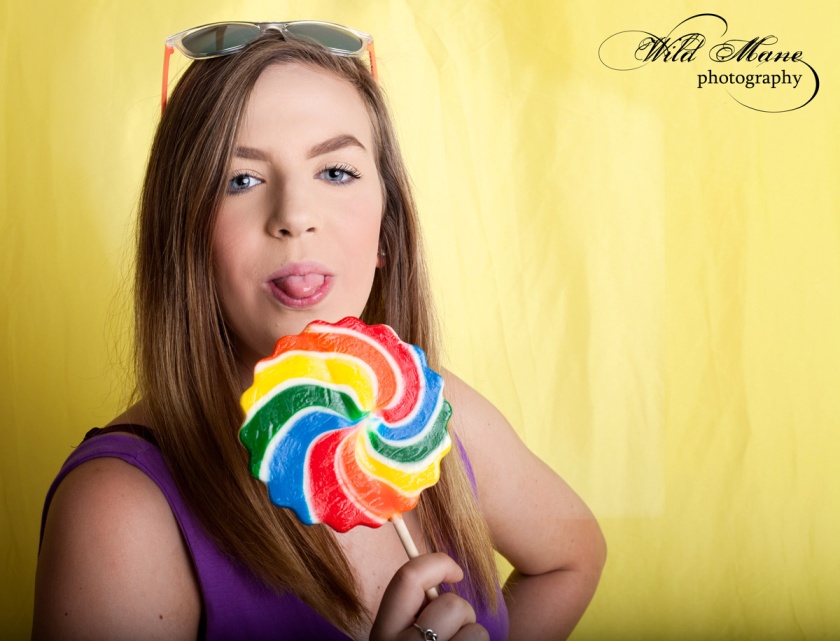
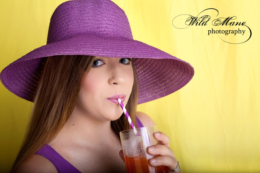
The yellow series really pops.  The royal blue is the perfect compliment.   The purple would also look nice. We were swapping outfits and backgrounds for nearly 3 hours as we photographed.  It took a lot of time even in its simplicity to prepare and shoot this session.

WEB_8565_BW

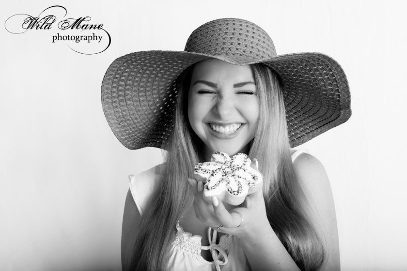
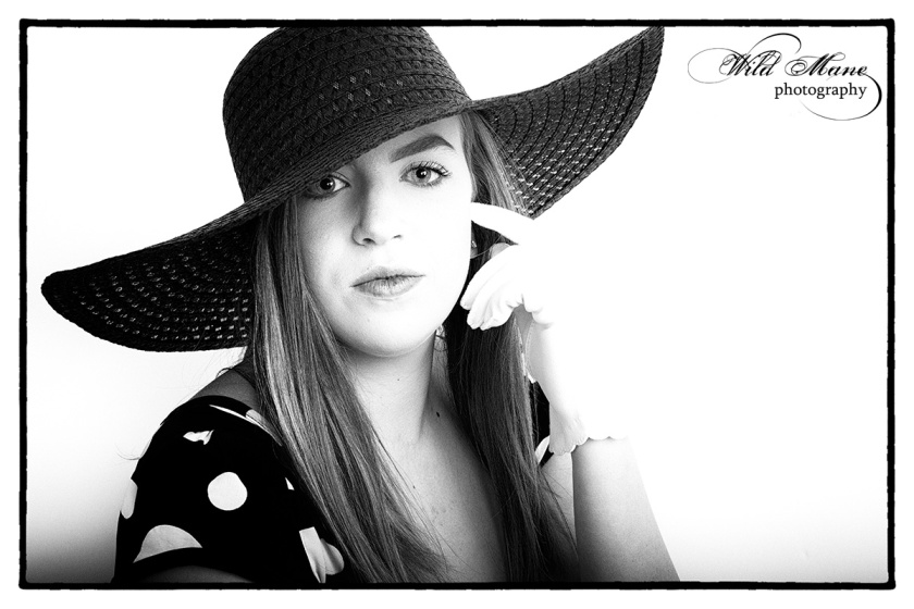
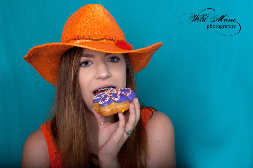
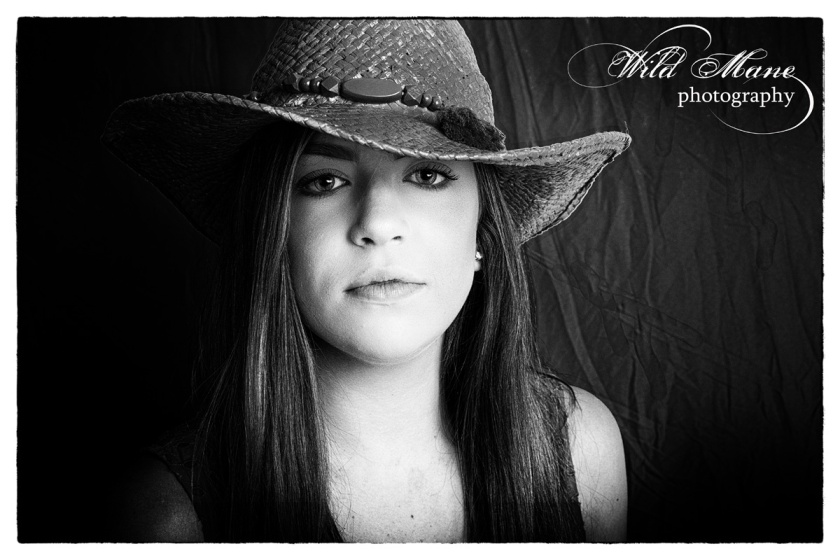
With all of the color, I couldn’t resist converting some to black and white.  Don’t you just love Jordan’s expression.  And she didn’t even get to take a big bite out of that fancy donut.  At least not until later.  We sent the girls home armed with a box of donuts.

WEB_8576

Since I am trying to think “commercial” as I shoot these days, I shot this and a number of the other images with negative space on one side or the other.   That works well if text needs to be added for a project.

WEB_8727

After all is said and done, I think my favorite images of Jordan are on the purple background.  I did add the pattern to this one just for interest.

Until next time, stay cool!


Color, Color Everywhere, Part 2

WEB_-8759

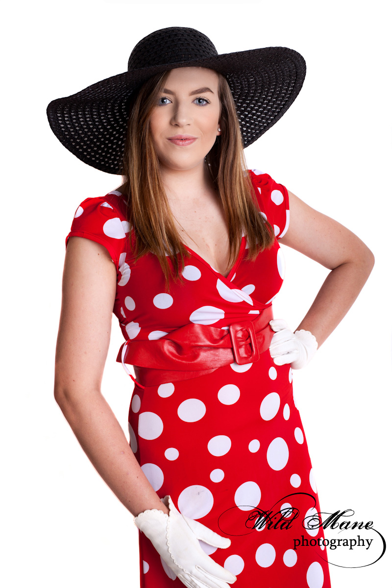
Color everywhere doesn’t always mean vivid backgrounds. Sometimes a white background is the perfect thing for color like this outfit.   It makes it and our model pop off the page.  And, these images look equally good in black and white with their high contrast.

WEB_8755_bw


Part 2 of Color, Color Everywhere features Danielle.  She was one of our two lovely models.  She did a great job and was very willing to go along with all of our crazy ideas including wearing shoes we spray painted bright orange which, of course, don’t show in this next shot.  I have found over the years that I rarely shoot full bodies.  It isn’t what I like.  I guess I may as well quit worrying about what my models have on their feet!

WEB_-8709_A

We intentionally chose fairly flat lighting for this session.  We used a 96″  parabolic umbrella with a diffuser and a 48″ octabox.  We still got directional light but very little shadow.

Since I am involved in the Project 52 commercial photography course this year, you’ll notice that we incorporated food in some of our shots.   Some are silly shots but all coordinated with the overall color themes we used.

WEB_8608

WEB_8641

As you can see, Danielle was asked to pose in different outfits with different moods and with looks from silly to sophisticated.  I think Danielle had a good time.  We certainly did.

WEB_-8768

My next blog entry will be part 3 of this series and the last of the series.  It will feature Jordan who was our second model.  See you soon!

Color, Color Everywhere!


WEB_8692

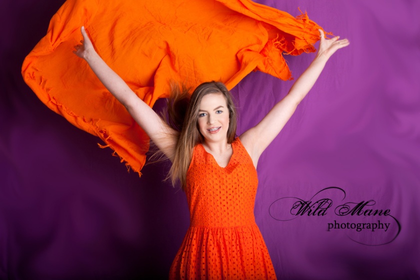
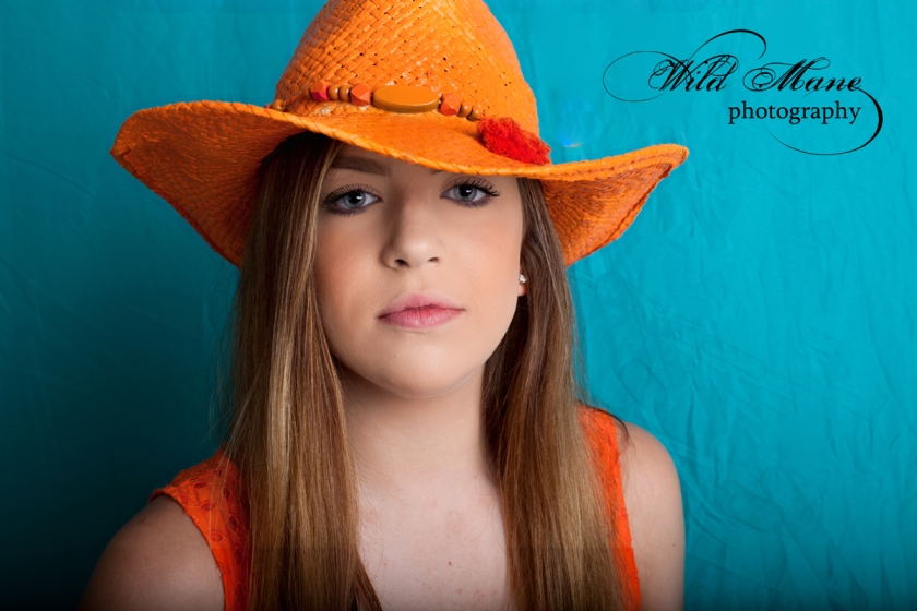
I did a Color Block photo shoot with another professional photographer and it was fun, fun, fun! We had two delightful young ladies who modeled for us.  Our concept was to use wildly bright colors using several different backgrounds with various outfits we provided in complimentary colors.

WEB_8623

It took us weeks to pull all of the “stuff” together that we needed.  The backgrounds were the easiest thanks to Groupon.  Trips to several different thrift stores, dollar stores and paint shops got us started with hats, purses, shoes, scarves, makeup, nail polish, eyeliners lipsticks and even wigs.  We didn’t use everything we got in this session.  It took multiple hours to shoot two models with multiple changes each.  We plan a second session sometime later.  Along with some existing clothing and props like umbrellas that we already had, we were ready to start putting everything together for different sets. Once we began putting outfits to background, we started spray painting accessories like hats and shoes to complete our desired looks.  It’s amazing how spray painted straw hats (like the purple one above) come out so well.

WEB_8729

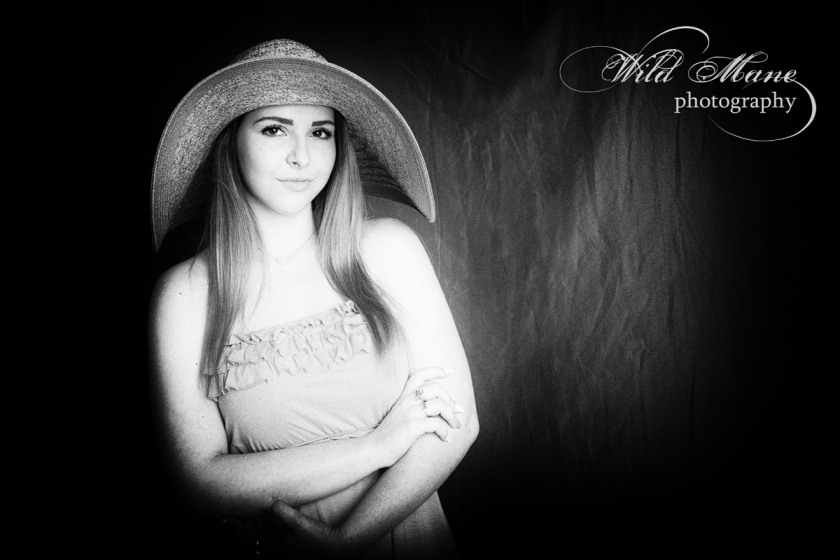
We mixed and matched hats with different dresses.  As we shot different looks and scenes, we each had images created by our own individual styles.  Once we got going, we found ourselves coming up with more ideas than we could possibly shoot in one afternoon.  These concept shoots get so exciting as we expand our original ideas to match our enthusiasm and our models’ personalities.  When I got to post production, I found some of these bright images also looked intriguing in black and white.  On the other hand, you can’t see that turquoise background, orange dress or that orange hat.  I love this moody look, though.

WEB_8629_FILM NOIR

WEB_8629

WEB_8673

WEB_8675

This is just a taste of how our Color Block concept shoot went.  I’ll write about this again with more details, more pictures and more backgrounds soon.  See you next time.  Happy Saturday!

Wired

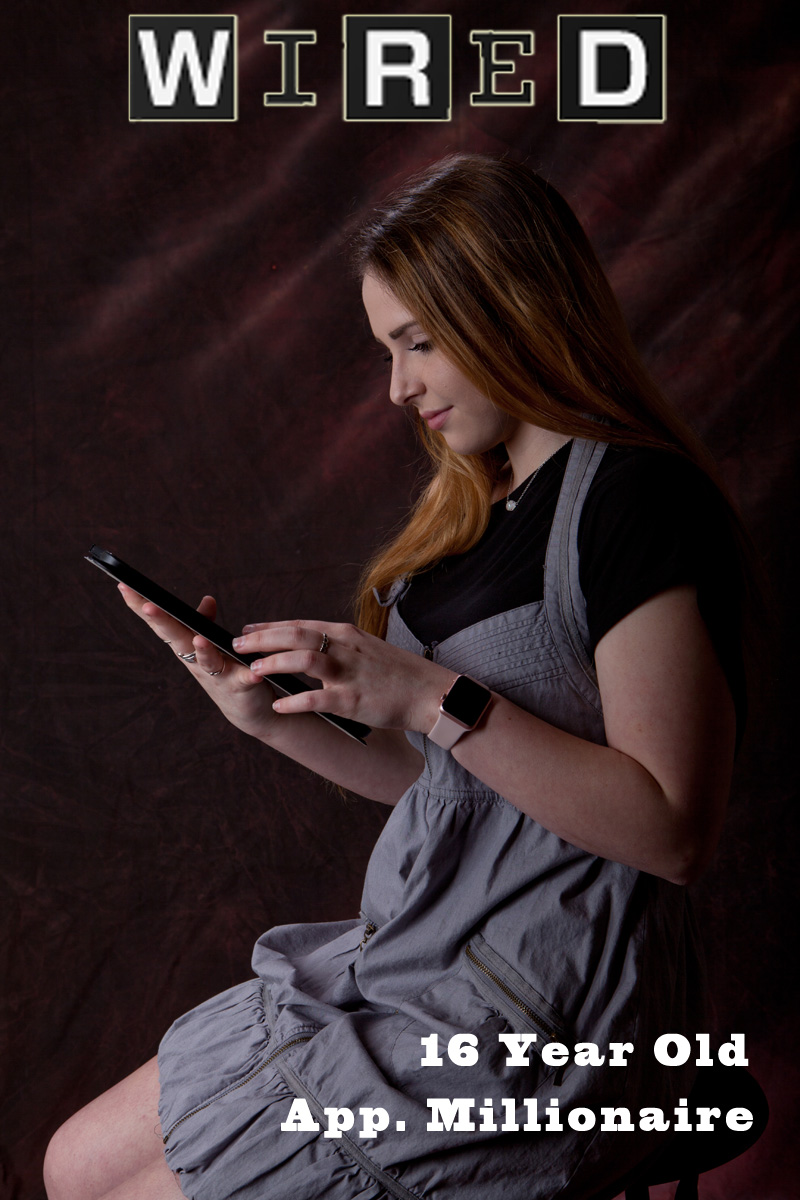
1_GloriaMcDonald_assignment 28

Assignment 28 brought us an assignment that took a lot of interpretation for me.   We were to produce a cover in the style of Wired magazine and incorporate our own style with theirs.  Wow, was that hard!  I am finding that when I have to interpret someone else’s vision, I struggle.  I am used to shooting portraits with my own vision, my own style and directing my client to achieve that.  In this case, I was trying to fit my creativity into someone else’s needs and wants.  I’d better get used to it if I am going to add commercial photography to the things I do.

I used to be an art consultant in Southern California back in the early 1990’s.  I worked with interior designers finding art that fit the design jobs they were hired to do.   Sometimes they would ask me to commission a particular artist to create something for them with specific colors but similar to something I had shown of the artist’s work.   I had some artists who could do commissions beautifully and others who could not do them at all.   I remembered all of those who struggled as I waded through ideas and tried to figure out if any of them fit the vision of our instructor.

It was a good exercise for me because of that block I was trying to overcome.  I needed to be able to tell the story of my model and explain why she was on the cover of the magazine.  Since the instructor told us he just wanted an image not text, I didn’t feel that I met the needs of the “invisible client” that I was trying to make happy.  I finally made my own magazine cover with explanatory text.  I turned in my original image which was the one I knew was best technically but I also added a very similar one with the text that I wanted to use.

2_GloriaMcDonald_assignment 28

This course continues to help me see through the eyes of an art director or an individual.  I really love solving the unique problem of being creative, meeting the vision of the art director and melding them into a well composed image that is appealing to many.

The Pour

I had another “stretching” assignment this week.  By stretching, I mean me!  How many of you have been asked to do a pouring shot that shows both the item used for pouring and the item receiving the liquid.  The liquid had to be frozen in motion and crystal clear.  This took a whole lot of practice and finally my husband’s help to accomplish.  It was something I have never done before.  Lighting is completely different than what I use for portraits.

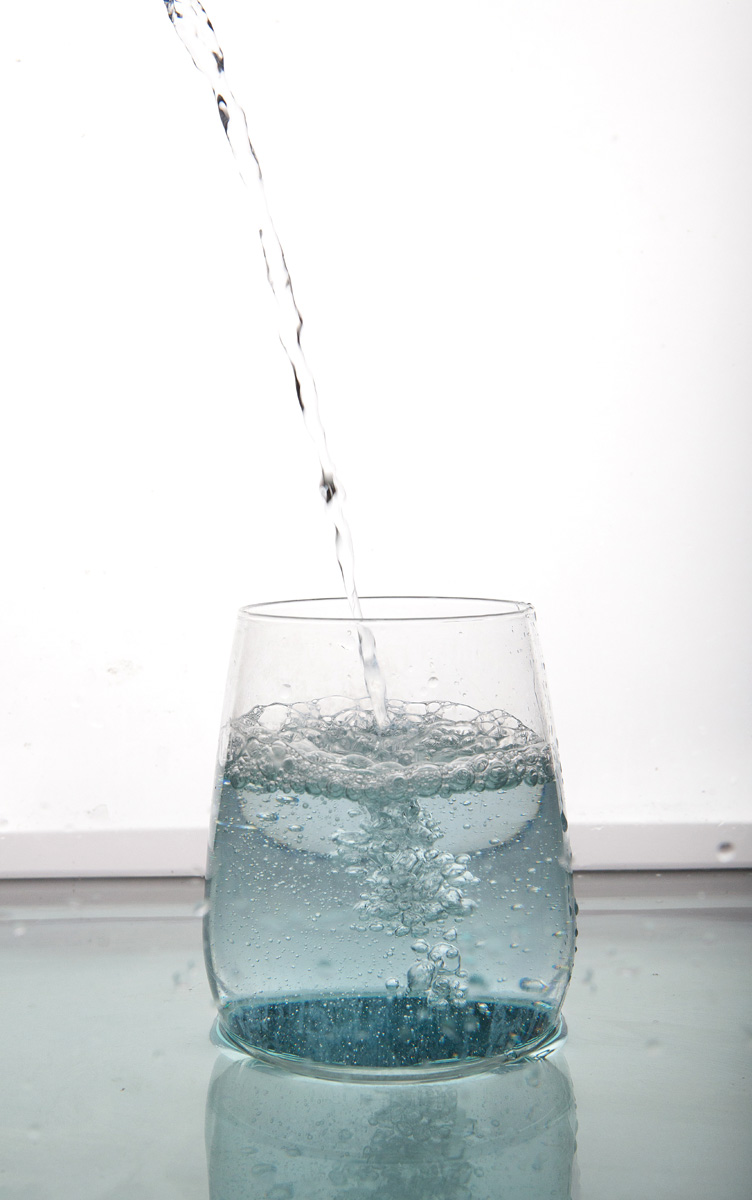
The assignment:  Shoot a verticle image that shows that is appropriate for a front cover of Pour magazine.   The liquid must be tack sharp and the lighting must show the edges of the bottle or glass well, any labels readable and room left for the name of the magazine.  Since I began alone and was working in my studio, I started practicing with water in an empty fish tank so all the water didn’t end up on the floor.  I had to shoot from my tripod so that I could get it focused and ready before I poured.  I used my mirrorless camera which shoots 11 frames per second and began with just water and a pitcher.  I stood beside my tripod and pushed my shutter button down with my right hand and poured water with my left.  Here is the initial result:

WEB_8369

I had practiced enough that the bottom of the glass was submerged so the glass looks weird in my opinion.  The pour was over exposed but I did like the bubbles and foam in the glass.

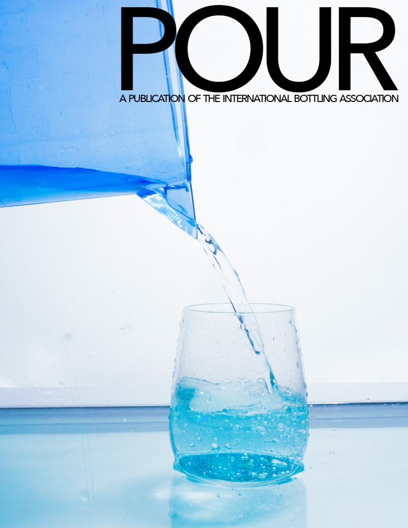
Step 2 was to try and create the pour showing both the pitcher and the glass.  As I did it, I still settled it into the fish tank.  That deep tank stopped me from being able to tilt and glass while I poured and pushed the shutter button.  I went ahead and used the instructor supplied magazine cover template.  There was still water in the bottom and I didn’t have my camera quite straight but at least I was getting there.

4_GloriaMcDonald_Assignment 26

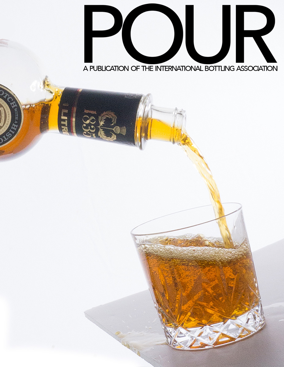
My final image is below.  I wasn’t crazy about the blue image even without the water in the bottom.  I knew I could do better with some help and, thankfully, my husband was more than willing to help me.  I found an ancient bottle that was nearly empty so I mixed food coloring and water until I got a nice amber color.  I added that to what was in the bottle already.  Of course, my studio smelled of booze by the time I was finished but at least it was all in the bottom of the fish tank and not all over the place as it splashed.  The image is lit from behind and reflected with a white board from the front.  That way you can see through the colored liquid and still read the label which was dark without the reflector.  I also had reflectors on both sides.  I attached the glass to a white board with gaffers tape so that I could tilt it.  I wanted to make the glass look as though it was on a table that was tilted and the liquid splashed out of the glass.  My husband poured as I held the glass in one hand and pushed the shutter with the other.  Thank heavens for tripods!  In retrospect I would have liked it best without those foamy bubbles on the surface but I submitted it like this.  My instructor liked it a lot and also showed me how to make the top edge of that glass bottle show up better next time.

GloriaMcDonald_Assignment 26

All in all I learned a lot and was much happier with kthis final image than I was as I went through stages 1 and 2.  I really appreciate the technical expertise of pour shots now that I have done some myself.  I look forward to improving my skills with this as time goes on.  That fish tank was a real life saver since I didn’t want to drag all of my equipment outdoors to shot this assignment.

Well, next week is another cover assignment.  This time I even got to use a human!  See you next week.


A Campaign for Coke

This week’s class assignment is one that took some preparation and a lot of thought.  We were to study the new Coca-Cola ad campaign, “Taste the Feeling”, and then create two images that could have been used for that campaign.  It was to have the vintage look that Coke is known for but with a modern twist.  It was also to represent my region of the country in flavor.  Since I’m in Texas, it seemed appropriate to create an image using a western dressed model and add a horse or two for good measure.   Here is the first of the two images that I submitted for critique:

1GloriaMcDonald_Assignment#24

In order to meet the requirements, I went to three stores in search of a glass coke bottle.  I did find some little 8 oz. bottles at Kroger but they certainly didn’t look vintage so I continued my search.  I finally found 12 oz. bottles at a Mexican Grocery Store in Denton, TX.  I also learned that Mexican coke is made with cane sugar instead of the high fructose corn syrup that is used in the United States.  I bought 4 bottles of Mexican Coke along with fresh guacamole and some tortilla chips (not necessary for the assignment but who cares).

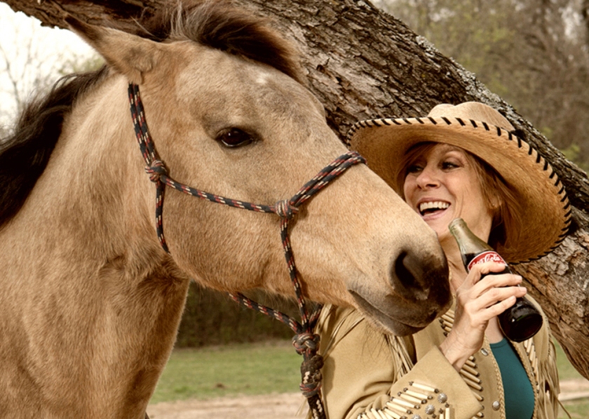
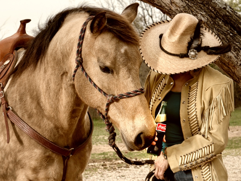
Take a look at the horse in this image.  That is Reyanna, my buckskin quarter horse.  During this photo session, she discovered that coke is really good.  Once she discovered that, she wouldn’t leave my model, Julee, alone.  Reyanna was after that coke in this image.  Julee was such a good sport and it was great to catch the interaction between them.  The day was windy and very overcast but so I added a little fill light from a strobe in a strip box.

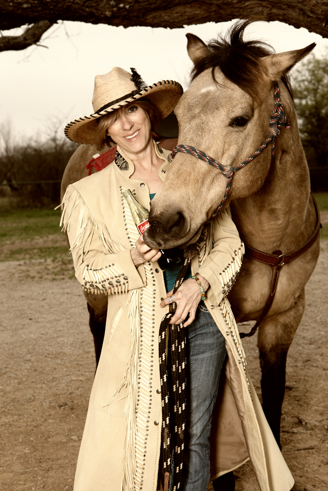
The second image includes a second horse, Safari.  The interaction created a casual, fun image with coke right in the middle of it.  The images that were used for the real campaign all have a color cast added to give them that vintage look that we have seen over the years in the older Coca-Cola ads.  I added an amber cast that I added to both of these images.  I think it carries the vintage idea but is also subtle.  Here it is:

2GloriaMcDonald_Assignment #24

All in all is was a successful photo session and a fun one.  The horses decided that that hat might taste even better than a Coke and they played right into my hands when they did that. My goal was to make sure that these images looked casual, unposed and showed Coca-Cola as an integrated part of them.

I decided not to use these last two images for my critique but I like them so much that I thought I’d include them in this blog. I love Julee’s hat and that coke bottle really shows up.  The last one showcases Reyanna’s new found love of coke.   She was trying to remove that bottle from Julee’s hand so she could slurp it up!

WEB_8143_B_cropped

WEB_8205_B_TINTED

A special thanks to Julee’ Kula, Reyanna and Safari for being great models for this week’s assignment.  See you next week!  In the meantime, enjoy a Coca-Cola and think about fun times.